Tendril: Brand Refresh
Brand Guidelines + Motion Design System
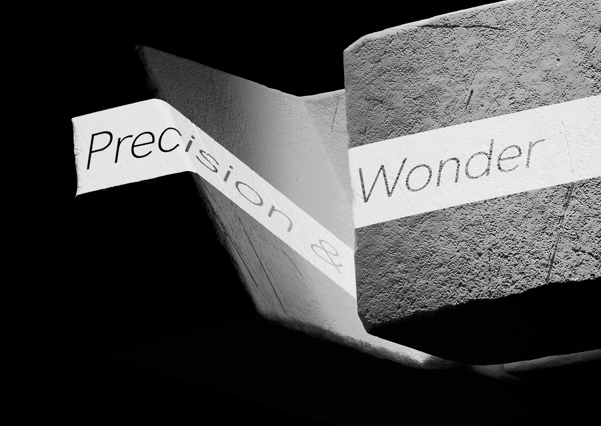
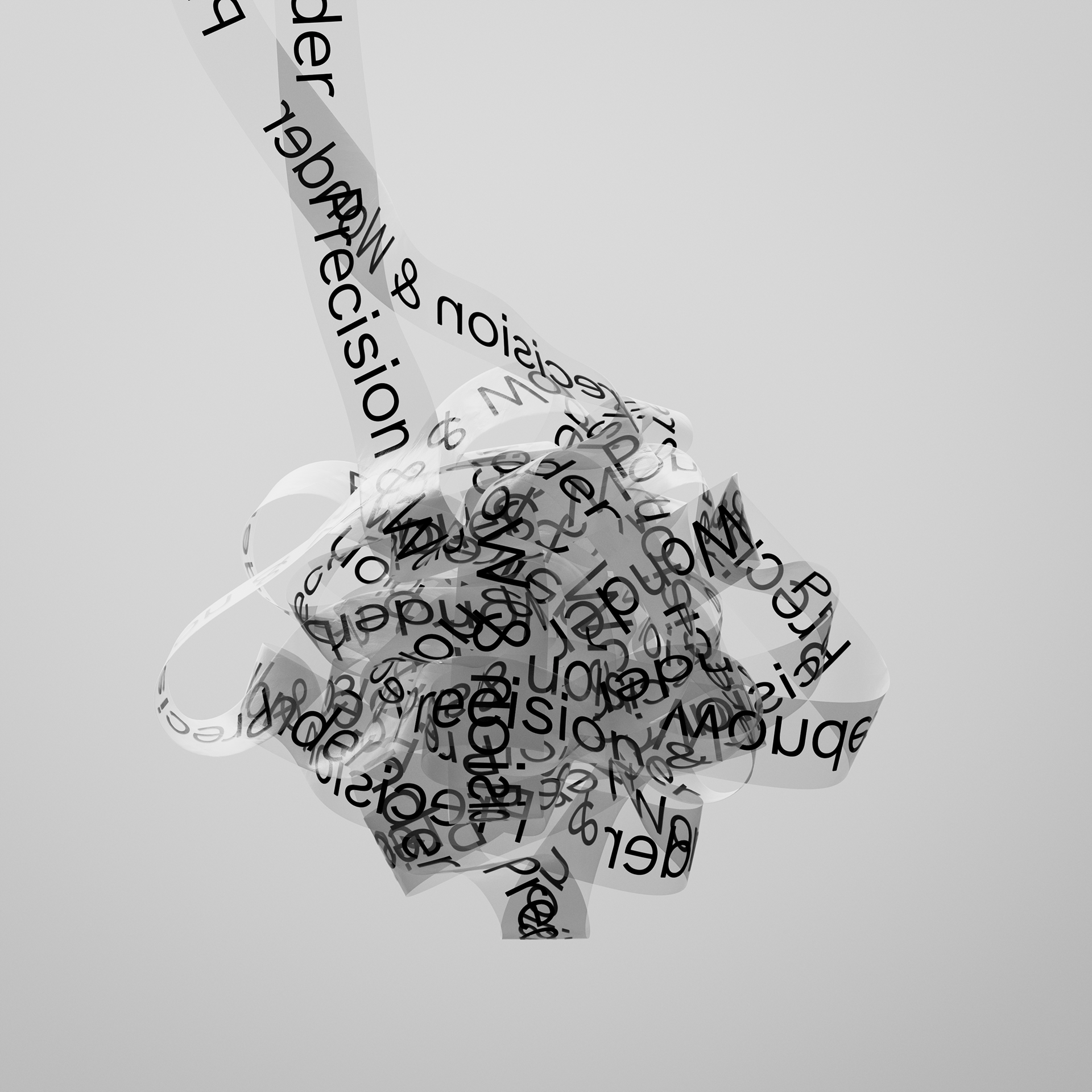
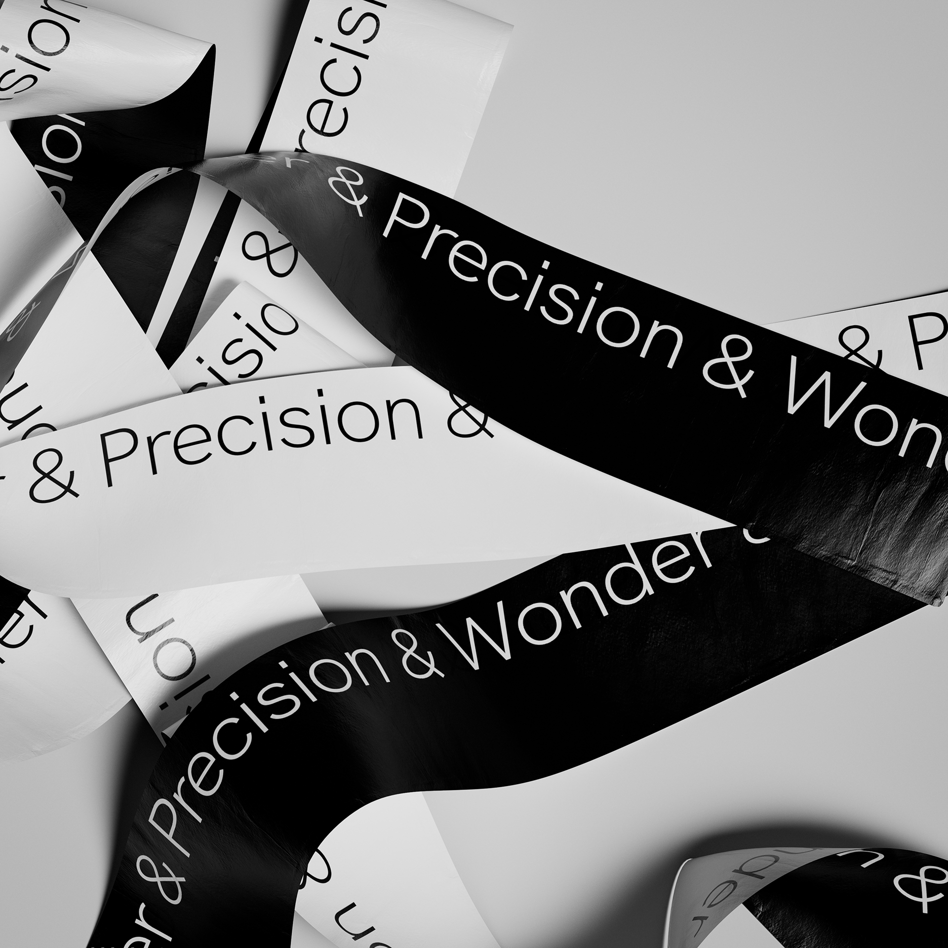
The Tendril Refresh. Tendril’s visual identity is a flexible system
that can be quiet, conservative, bold, and expressive,
depending on context and communication needs.
1/ Logotype
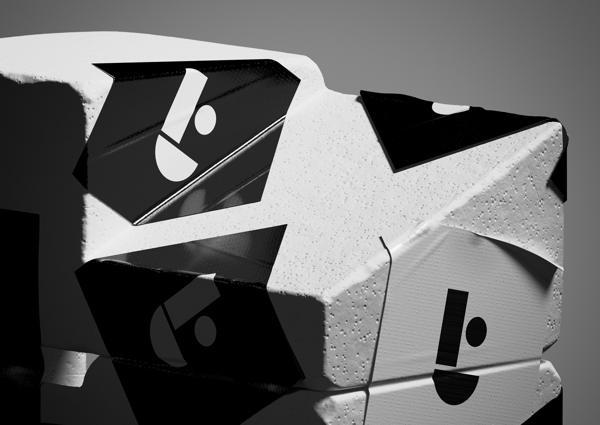
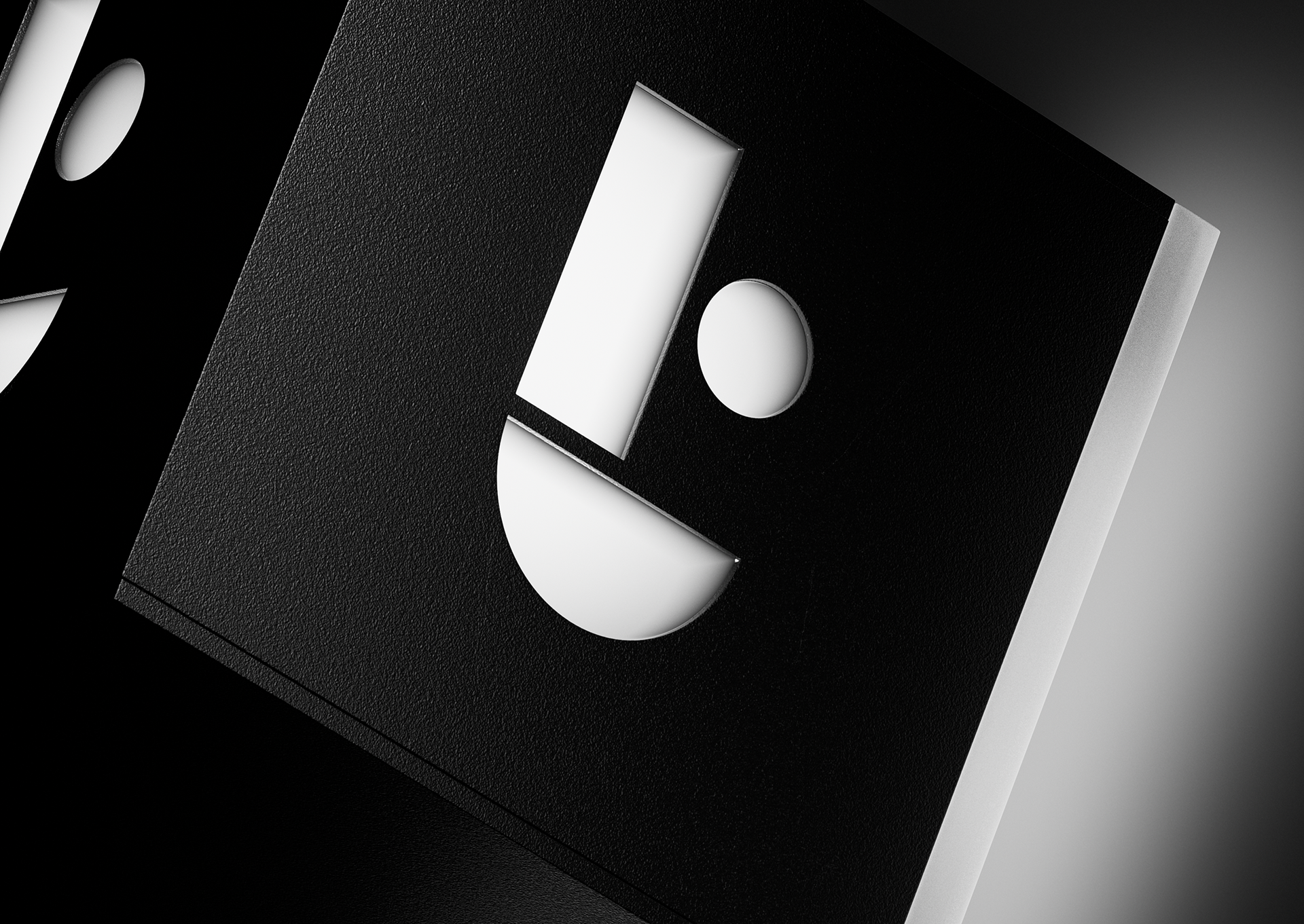
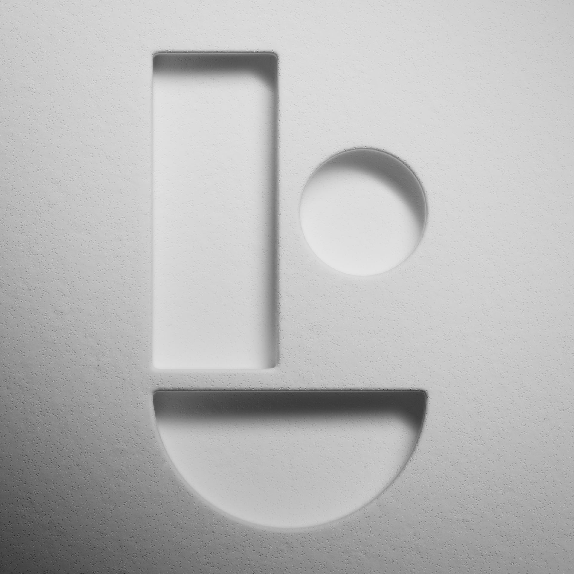
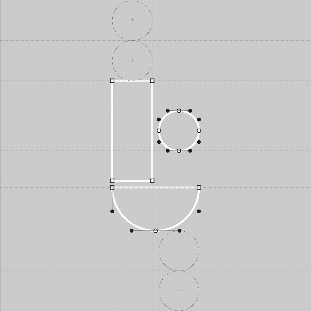
Meet the T-Dot
Meet the T-Dot
The t-dot is Tendril’s mark and most recognizable brand
element.Created by design studio Worship, it suggests
both a lower-case ‘t’ as well as a figurative emoji-like smile.
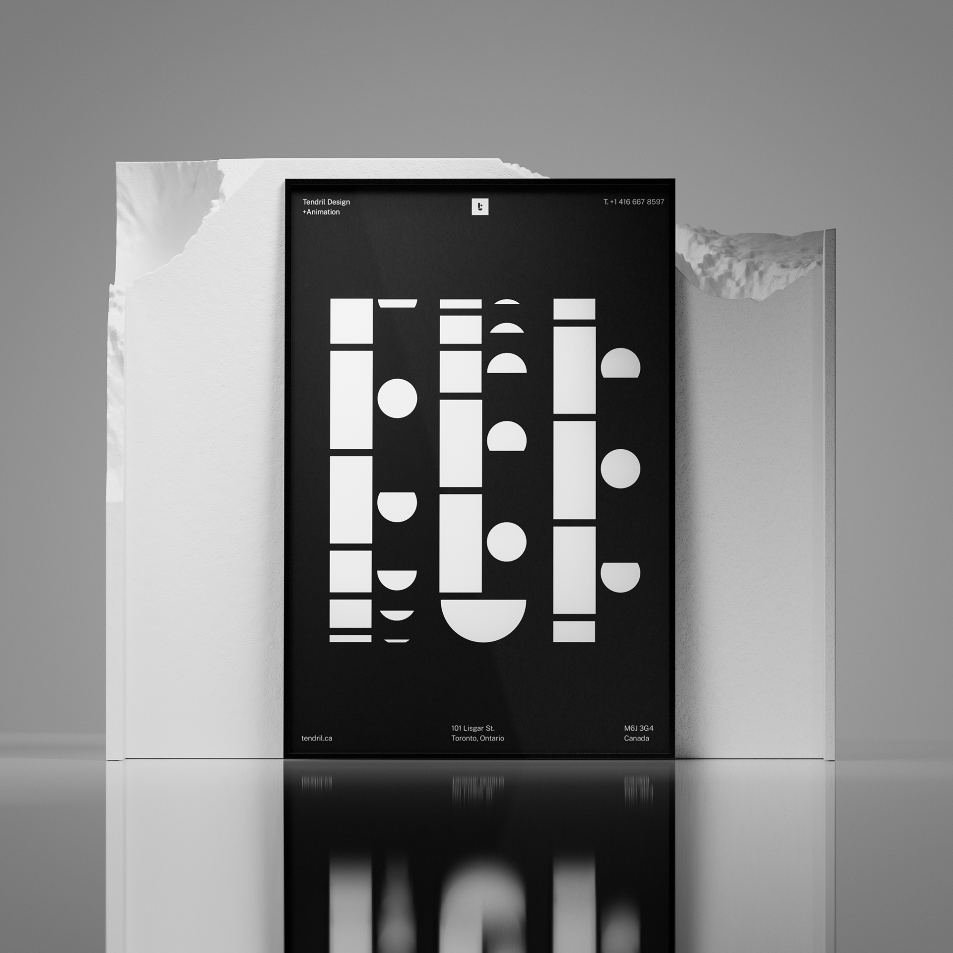
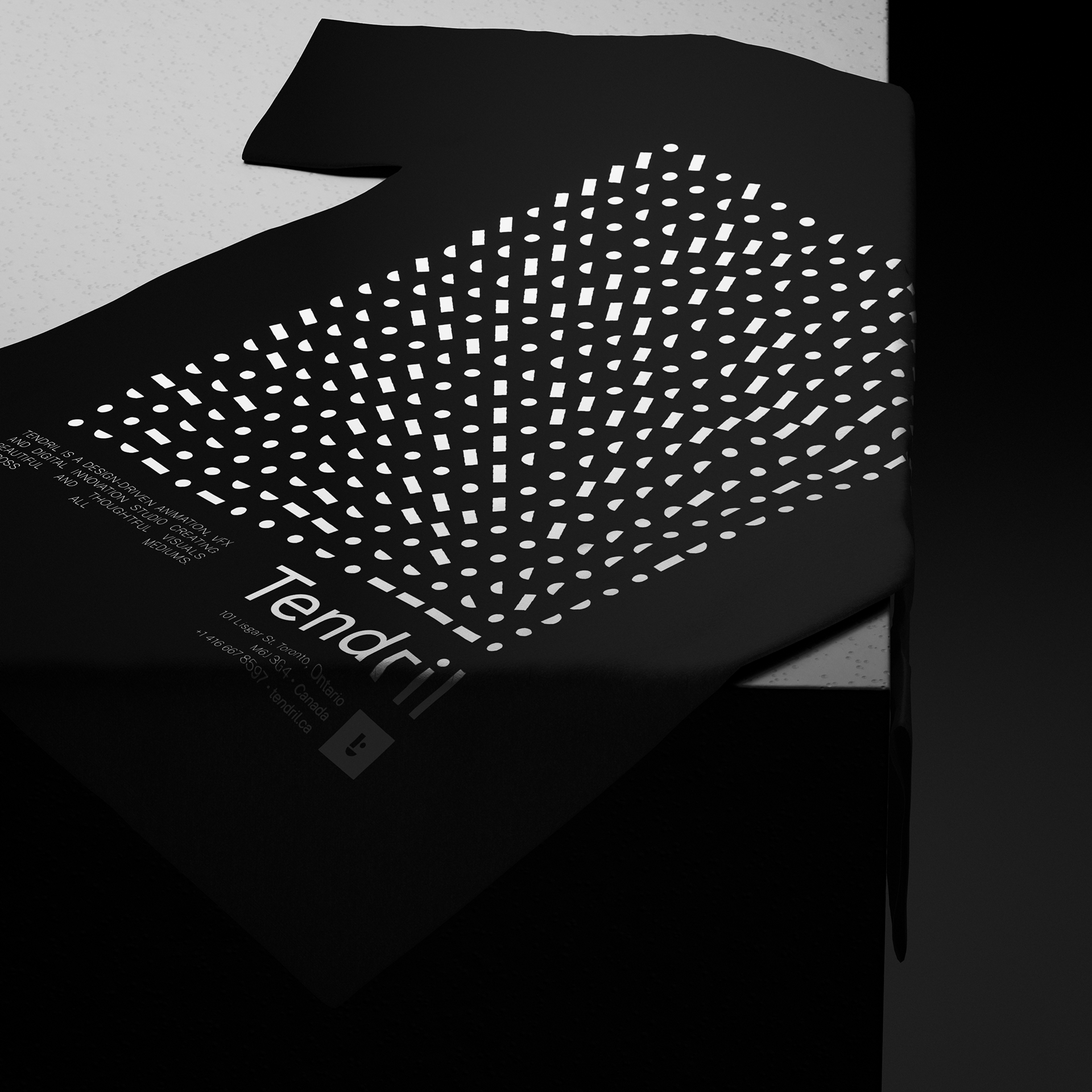
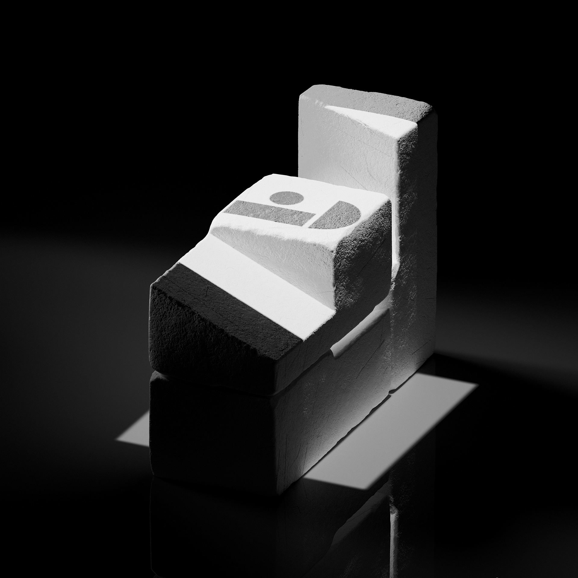

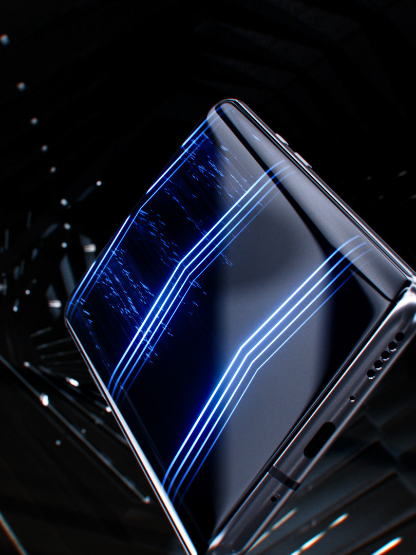
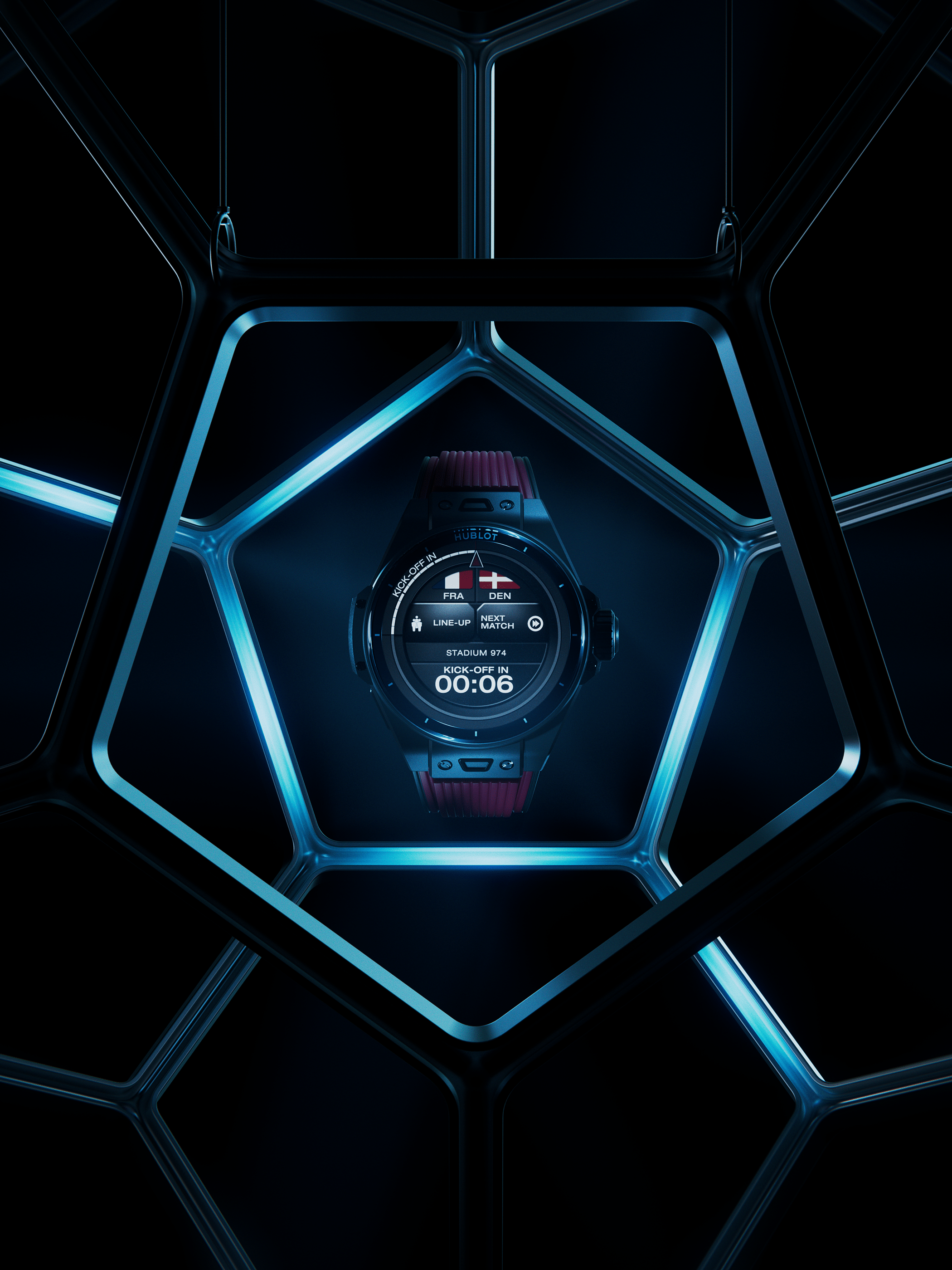
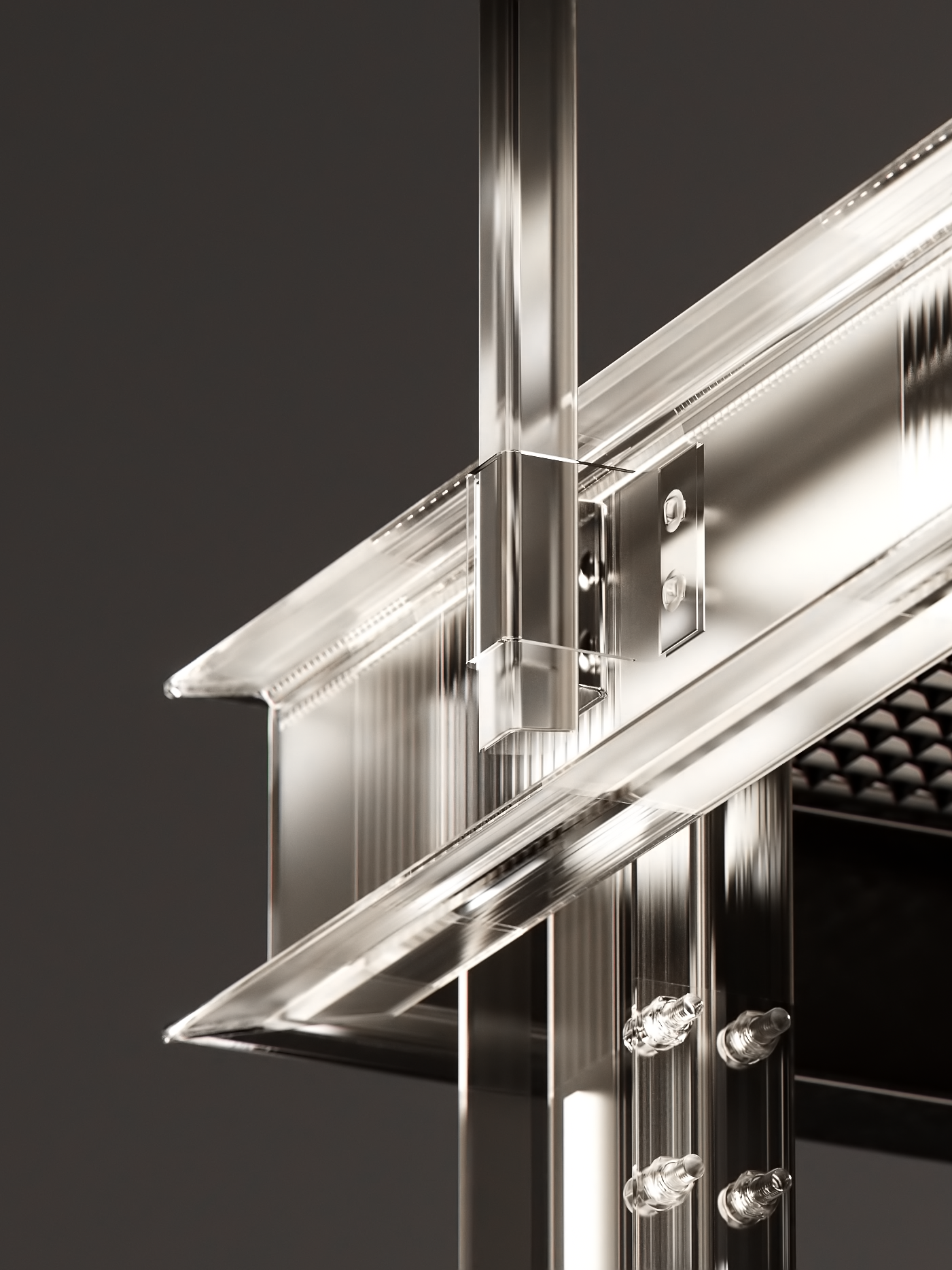
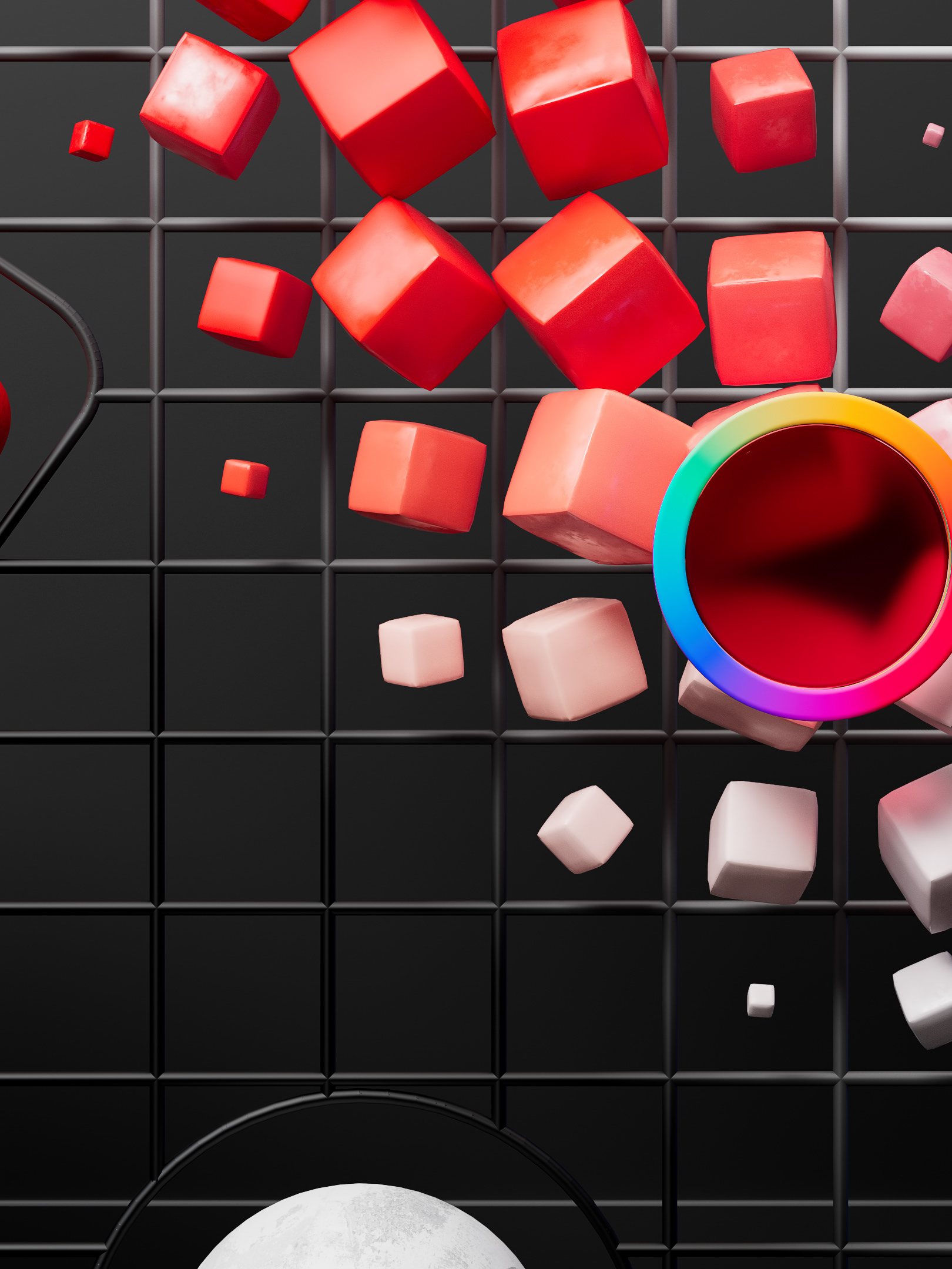
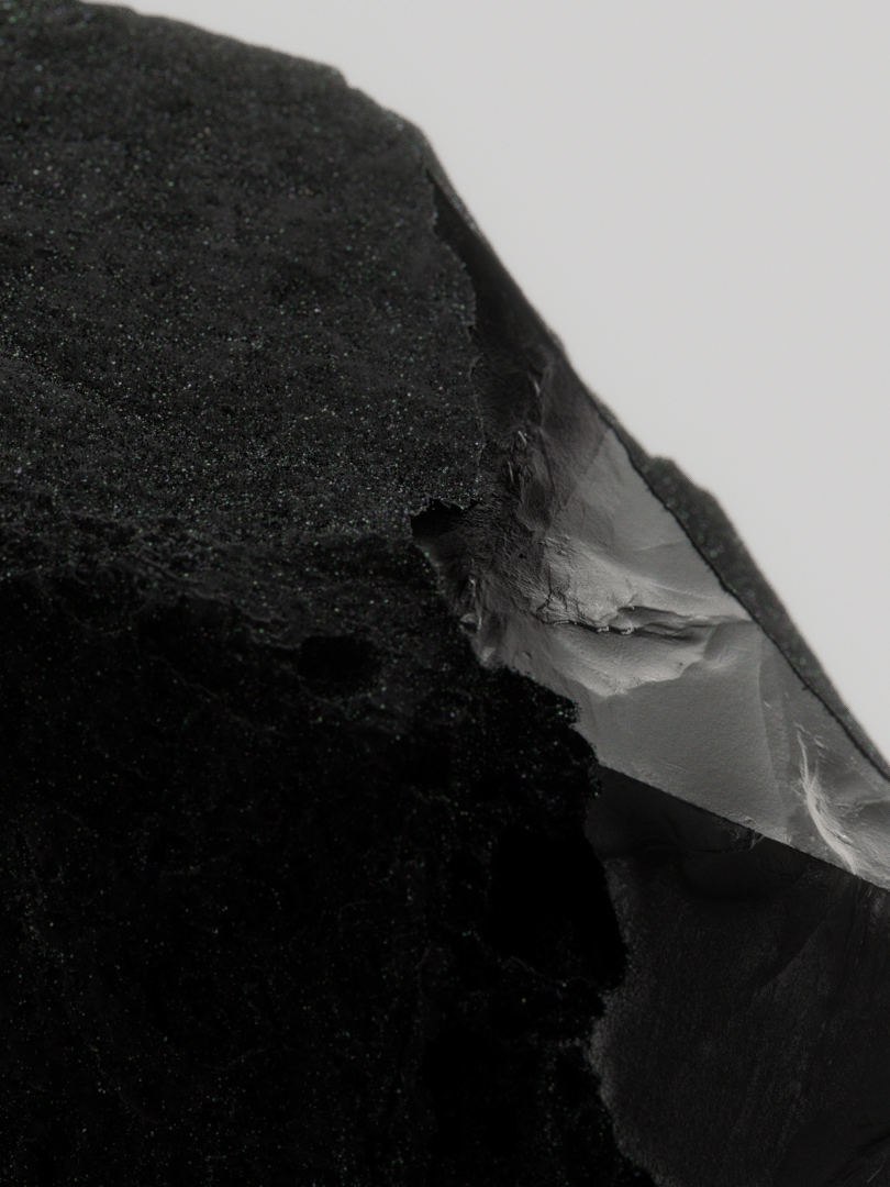
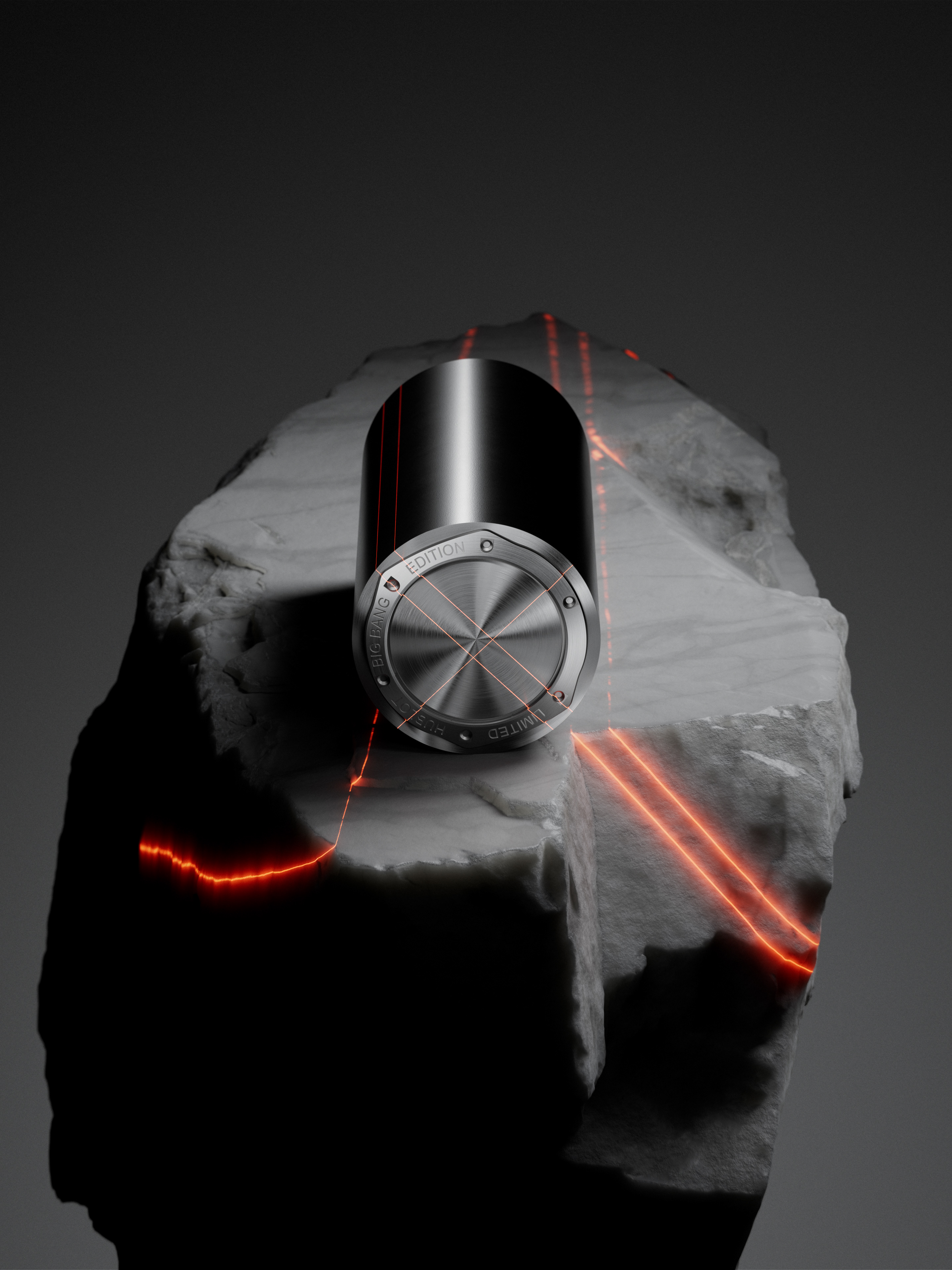
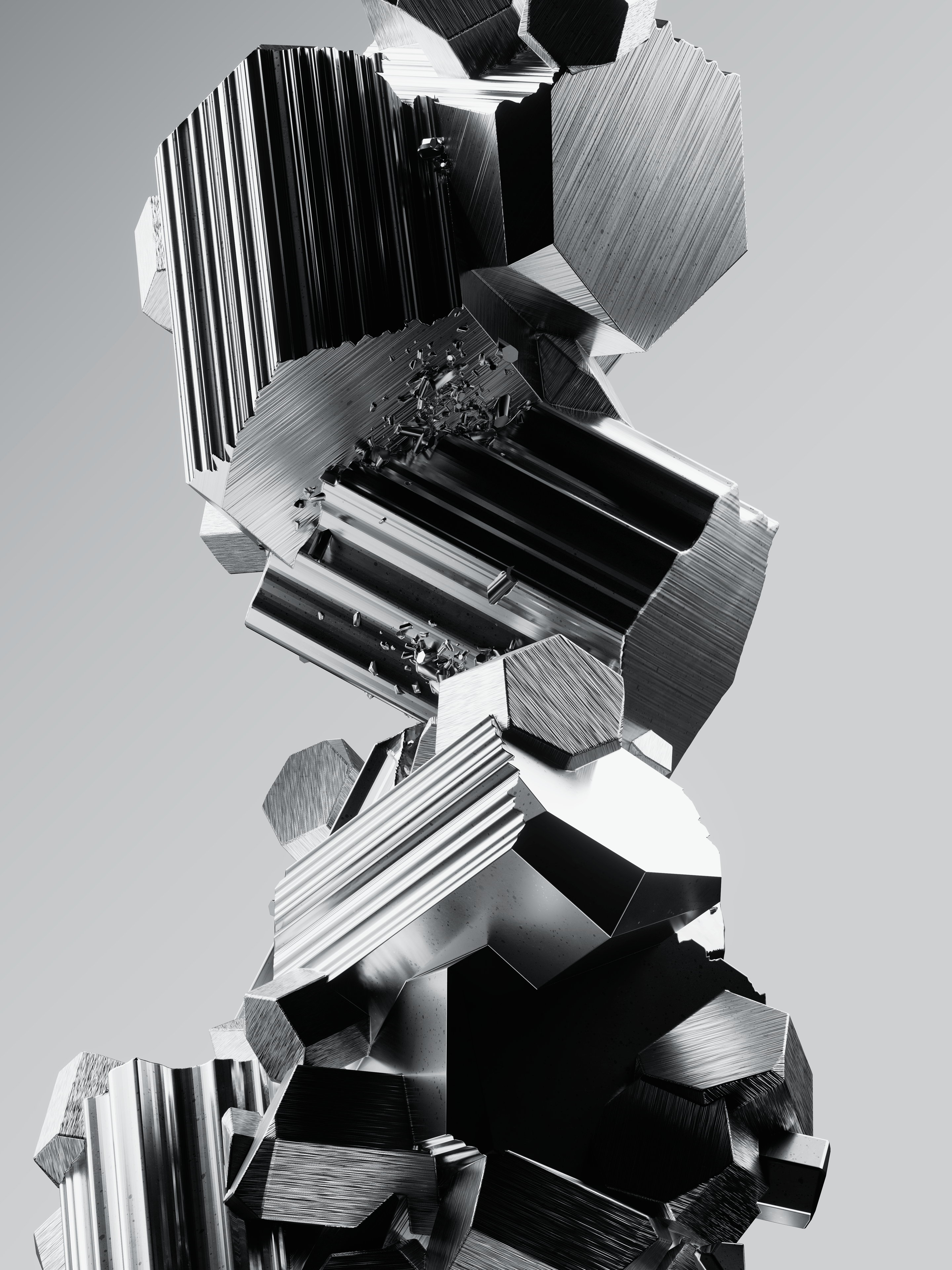
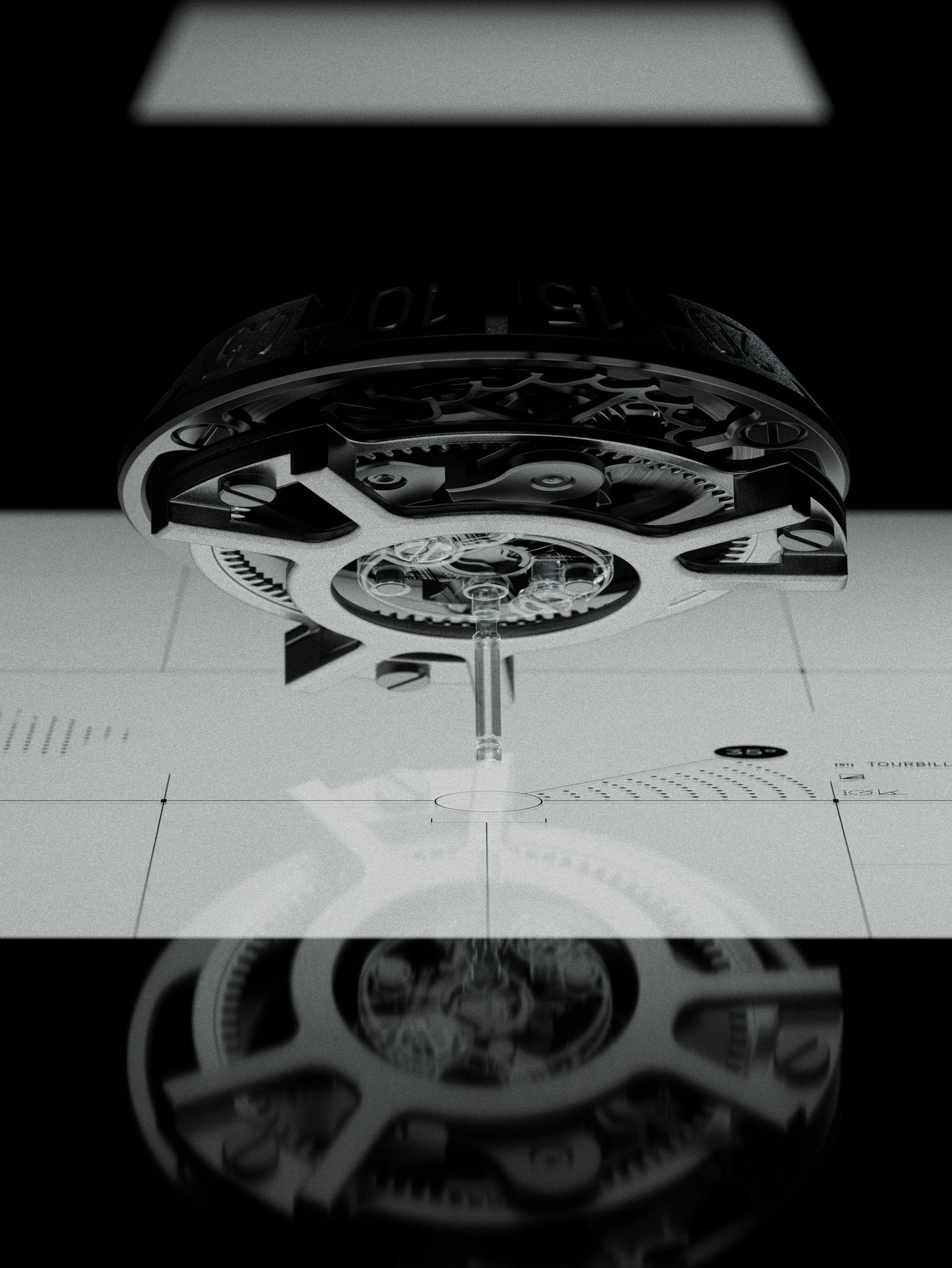
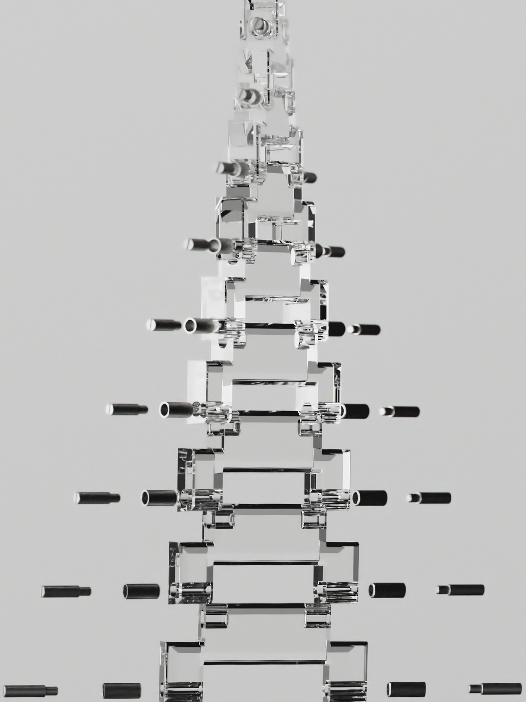
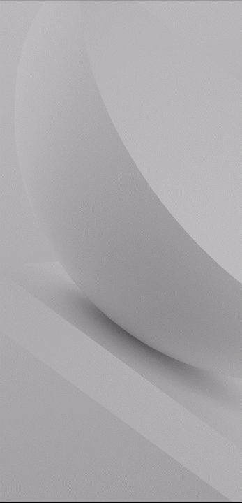
2/ Brand Imagery
The three geometric forms of the T-dot provide the perfect
building blocks for a library of minimal, abstract 3D
compositions that are a nod to Tendril’s expertise and roots
in 3D design and animation.


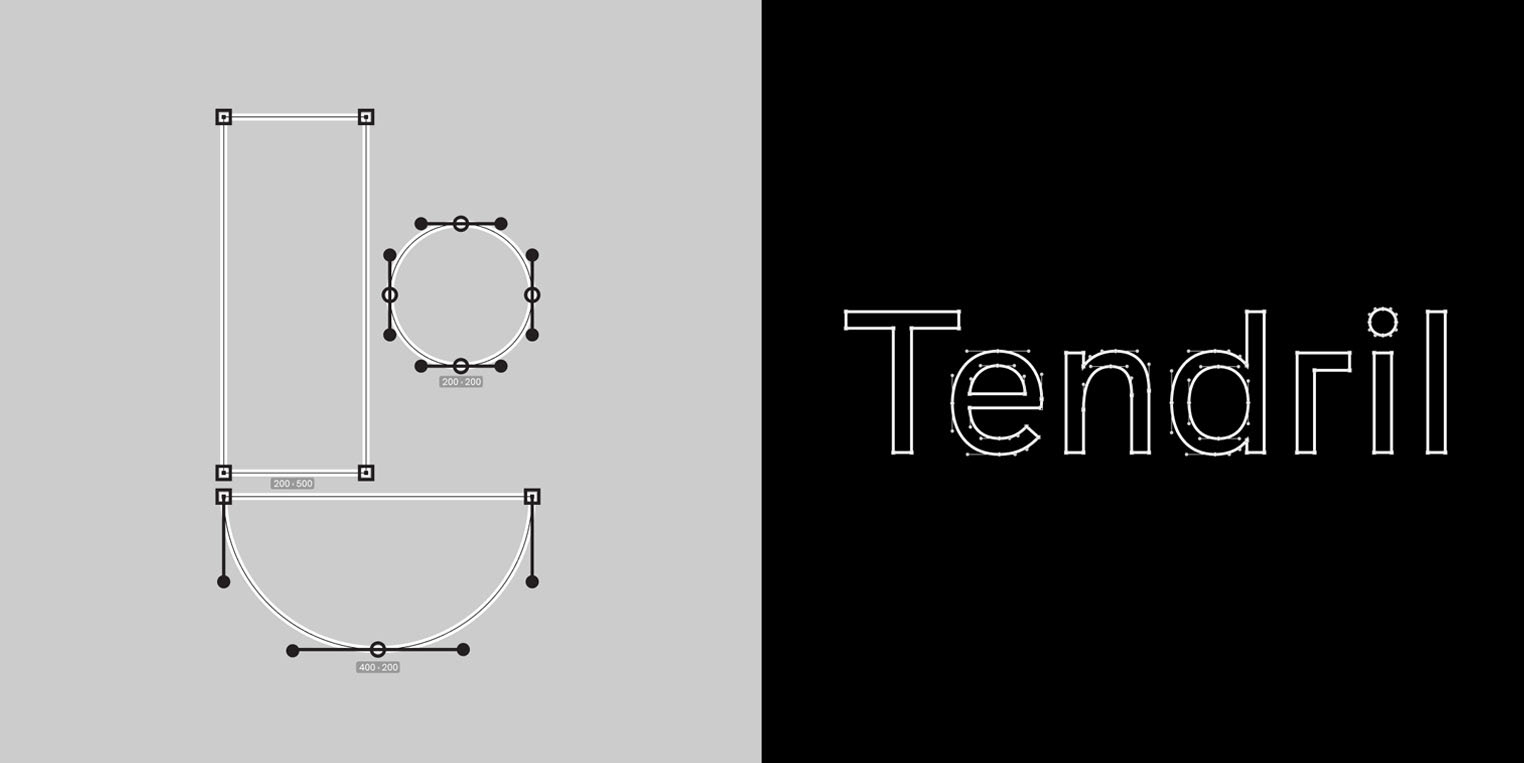
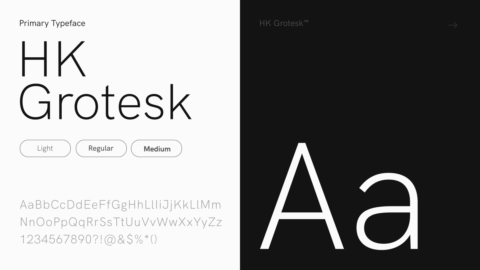
3/ Typography
HK Grotesk is our primary typeface for marketing and social
content. Public Sans is used for more corporate materials
and business communications.
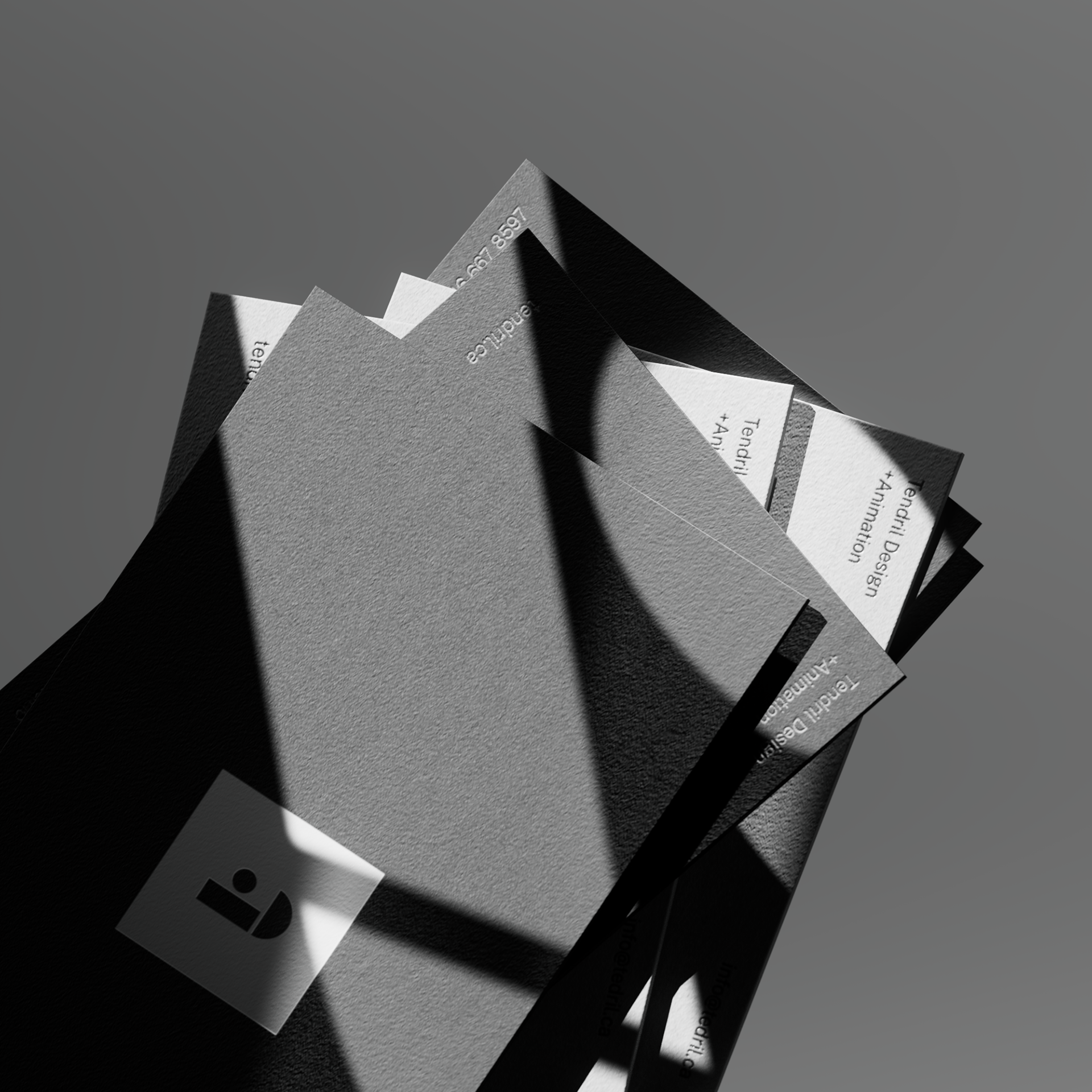
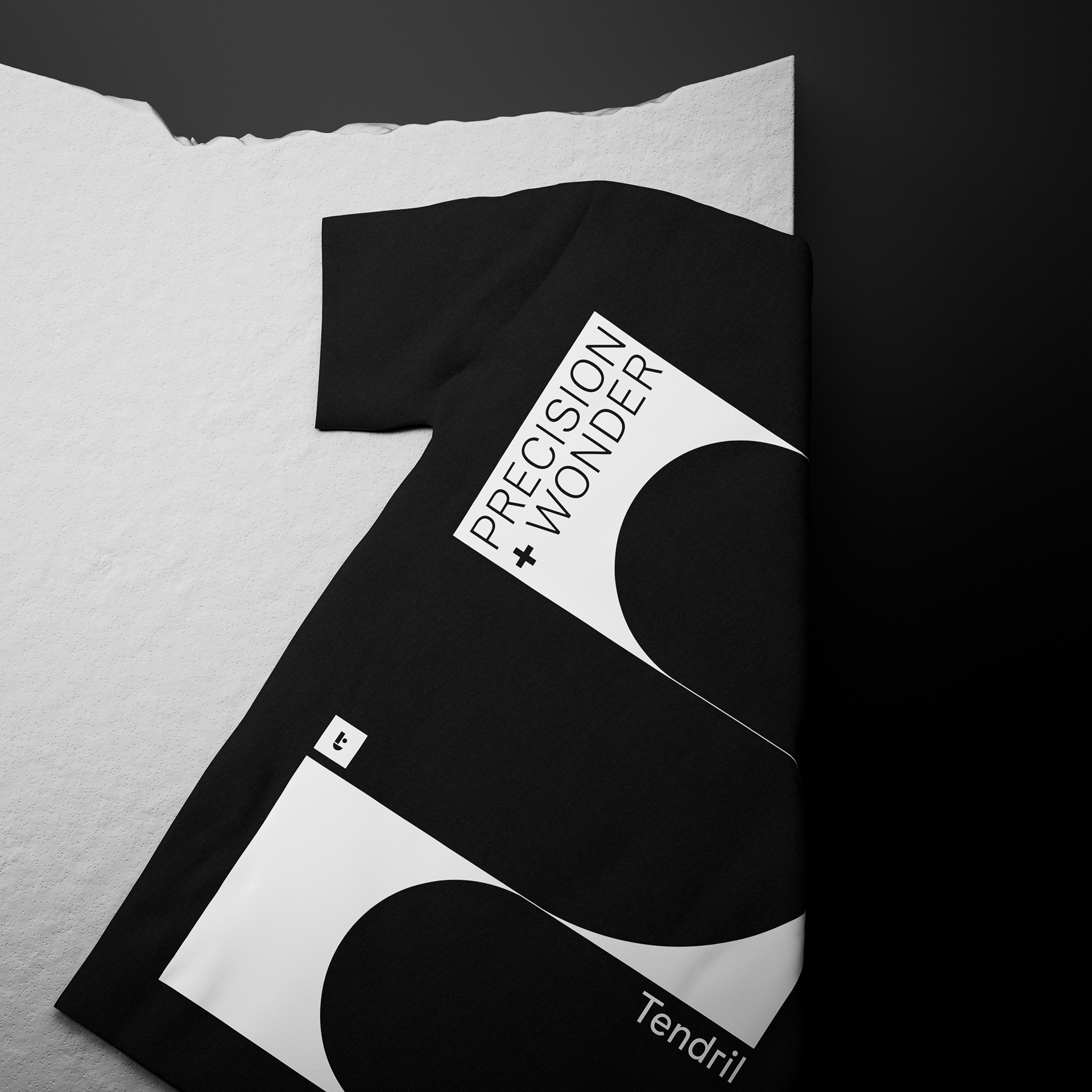
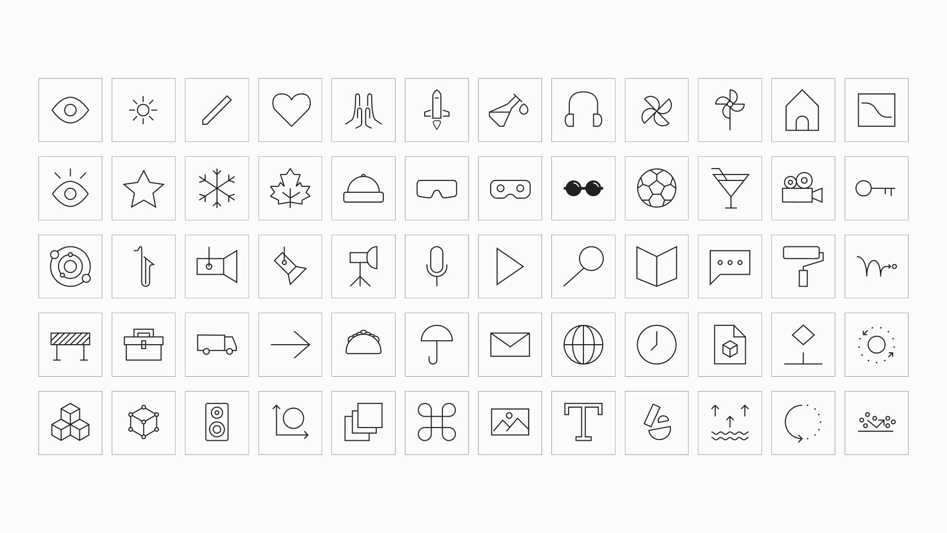
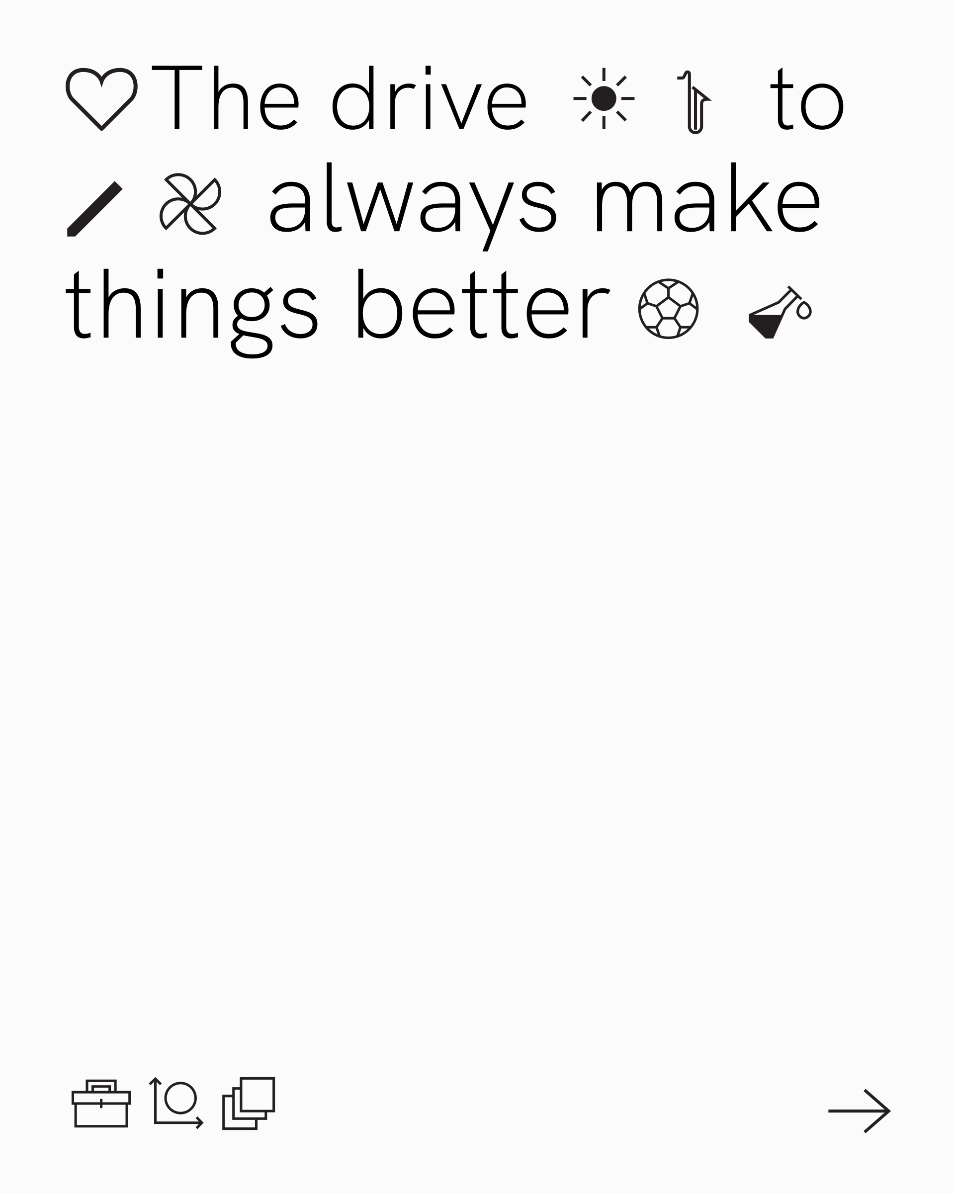
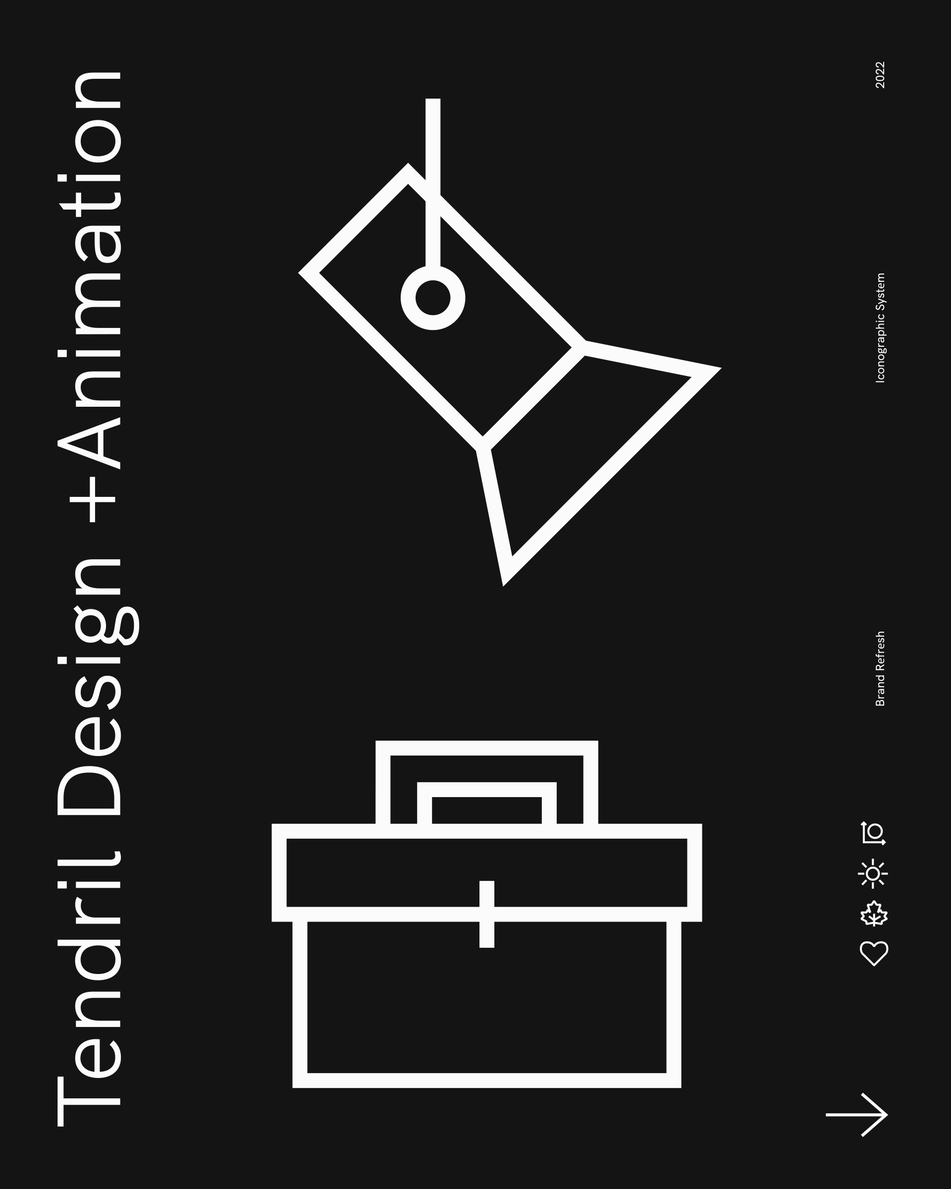
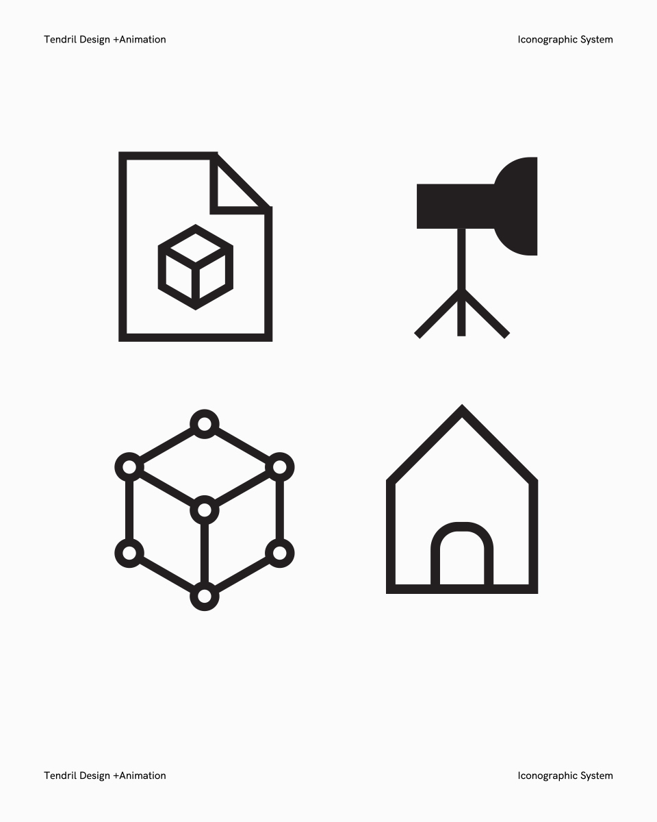
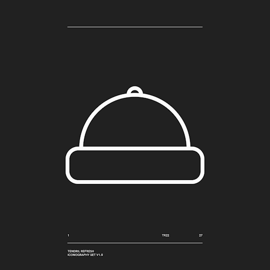
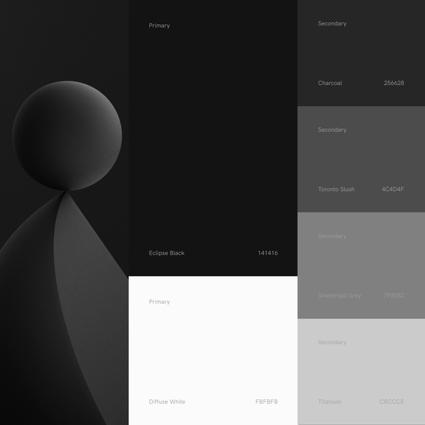
4/ Iconography & Colour
Tendril has custom icons and colours that match the
aesthetics of the identity. They can be used in a wide variety
of applications from social media and web, to presentations,
announcements and posters.
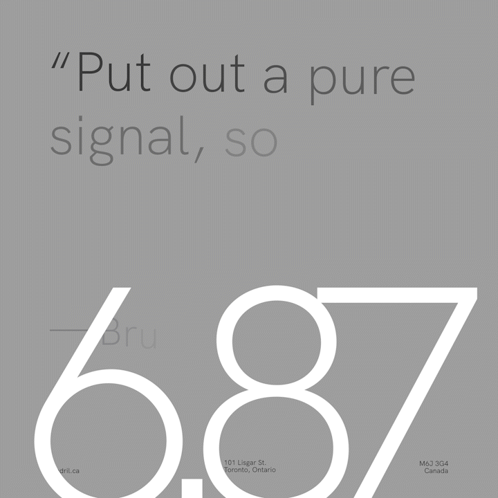
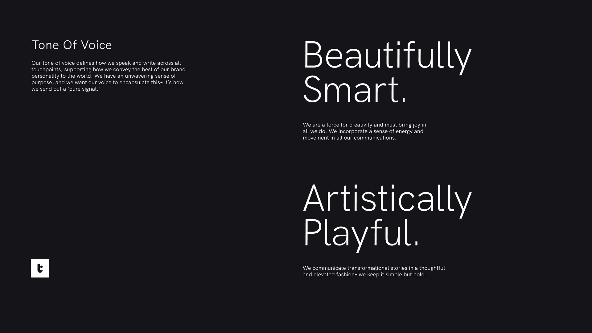
5/ Voice
We have an unwavering sense of purpose, and we want our
voice to encapsulate this– it’s how we send out a ‘pure signal.’
Credits
Visual Identity Team
Production Company: Tendril
Creative Director: Chris Bahry + Alexandre Torres
Brand Refresh Design: Worship, Rafa Cezar
Executive Producer: Ramona Gornik-Lee
Producer: Niko Hook
Guidelines + Toolkit: Rafa Cezar
Strategic Communications: Jill Wilkie
Content Strategy + Copywriting: Sierra Joseph
3D Assets Team
Design: Rafa Cezar, Joseph Recoskie, Aiden Riekenbrauck, Rita Louro, Shannon Hoyne
2D Animation: Rafa Cezar
3D Animation: Joseph Recoskie, Samuel Bohn
Light+ Render: Brad Husband, Joseph Recoskie, Aiden Riekenbrauck
Compositing: Brad Husband, Astrid Cardenas
ID Animation Team
Design + Animation
Joseph Recoskie, Samuel Bohn, Nidia Dias
Light+ Render
Brad Husband, Joseph Recoskie, Aiden Riekenbrauck
Music
CYPHER